jeudi 29 septembre 2011

Summerclass at Palm Fine Arts


Palm Fine Arts is a decorative painting school run by two of the most talented decorative painters, Lotta Olsson and Mats Carlsson. I will post on their work . They have been very kindly invited to me in their summer program for 13 years (!!!).
Here is a presentation of the last class.

Two paintings in a week. This was the program for this years's class at Palm Fine Art.
The plan for the first panel was simply to gently warm up.


Student's work

student's work

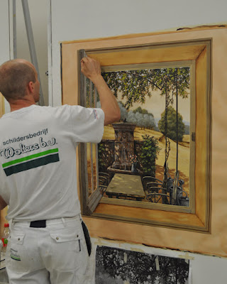
I usually start the class with a technical lecture about the "art of painting" , as I see it after years of painting and teaching but this time I decided not to talk too much. Just paint, demonstrate and let people grab what they could instinctively.
Some students almost finished this first painting but most of them just painted the tree and that was  enough to have a good foretaste of the techniques we would use for the rest of the week.


As the students had no time to watch me finish my panel I have provided pictures with short notes like this one.


detail of my panel

The second panel...


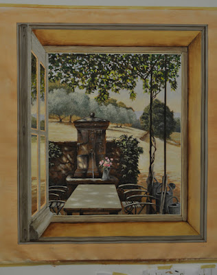
... is based on a nice trompe l'oeil I created a few years ago for a show.
It is a very technical one with a lot of different textures ( foliages, grass, stone, textile, wood...etc.), some graphic difficulties ( leaves, chairs...) and a strong focus on contrasts.


That was very ambitious for 4 days and to my surprise most people completed the panel ( or almost). Sometimes the magic happens and even if this takes efforts ( 10 to 12 hours a day) and courage everything works smoothly and we all get the work done.


Here is the piece I painted for my students...


dimanche 25 septembre 2011

September Collection


Here are a few pictures of my latest booth at Maison et Objet.
This time I had a square space ( it is not always the same size from one show to the other...you just take what they propose) and I chose to leave almost totally opened on one side. I exhibited a mix of ornaments , landscapes anf figures as usual but with a focus on works on paper (5 pieces out of 10, including my little ceiling) and I had a great response from my customers ( the old ones as well as the new ones).
The structure of the booth was extremely simple but quite efficient in terms of presentation of the paintings. 


 I like this old table I found in a flea market just before the show. The 1970's chairs are fun too but I would have preferred to find them in some weird color ... I have told myself, as usual, that next time I would take more time for finding pieces of furniture for the booth but so far I have always done it in a hurry, at the very last minute but I still think I will improve on this...next time ?!


samedi 3 septembre 2011

Paintings with a door knob.

The paintings on these doors were meant to acompany and balance the mural of the opposite wall ( Chapter 1 of Demeures Peintes , Hôtel du Marechal de Tingry. They are definitely the minor part of the design...but I like them as much as the major one.
Each door was treated as a whole but also as three different paintings nicely framed and separated from the rest by the  moldings. I think that even the small skiny panels have their own identity. This really is what I found exciting. When I look at a painting I like focusing on details and in this case  the structure of the doors was allowing me to recreate this style of vision.


I worked from Leornardo's drawings .
I drew with charcoal on basecoated paper and  sealed it with acrlylic glaze that I watered down and sprayed over.


Being ambidextrous I can write backwards with my left hand which helped me copying Leonardo's famous handwriting...