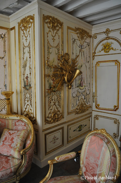
This client ( Atelier Louis XIV, high end french style baroque and classical furniture maker) was about to open up a showroom downtown Paris , in one of the most "deco" areas of the city ( rue du Mail). Most of the major players in the textile business are in this street ( Pierre Frey, Chelsea, Sahco, Brunschwig, Lelievre...even Pinto has his Paris office over there) and my client wanted to be close to these companies in order to create business relationship with them.
When I first visited the room, in July, the wall panels had already been installed and the "problem" was to make the place really special and attractive.
I visited the place, did sketches and watercolors and imported them in my pictures via Photoshop.
I then emailed those to my clients with a quotation. I had a positive response but I understood that he wanted something more spectacular , he told me about a beautiful green lacquered room in Wurzburg and said that would like something more colorful...
I kept the same design but porposed a series of different tones for the walls. Here is an example:
I had another nice email but I felt he was still looking for something "stronger", more powerfull.
I then decided to give up this style and picked up a model I had photographed in the Salon du Conseil in Fontainebleau , here is what I proposed...
Another very gentle emailed let me understood that I was making progress but that this type of figure might not be suited for Arabic clientele. I took an appointment with my client...on his way to France, onboard the train, he had read a magazine and seen a picture of the Salon Dore in the Palais de L'Elysee. That was it, he had finally found what he was looking for : gold. The panels would be gilded and I would paint over it. Here are the designs I finally created:
I made another Photoshop sketch and I had a GO!


what doesn't look better with lots of gold leaf? i don't know.
RépondreSupprimernice work, maestro!
So nice of you to share the relationship between the artist and the client. It is a 'give and take" relationship! I love the gilded walls.
RépondreSupprimerThis is such an interesting subjest and thank you for sharing about your way of responding to what your client desired.
RépondreSupprimerOh and be sure to come and join my Amazing Giveaway from Splenderosa!
xoxo
Karena
Art by Karena
Thank you all. I will post the first phase of the work itself very soon.
RépondreSupprimerI have been on your blog Karena, very interesting,congratulations.
Extraordinary -- I really enjoyed the story of the evolution of the artistry with your client. The end result is sublime.
RépondreSupprimerI thought the before was beautiful, but you somehow made beautiful even more so!
RépondreSupprimerI look forward to following more of your adventures...